Behind the Design
Felt Colorwork
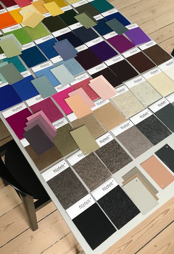
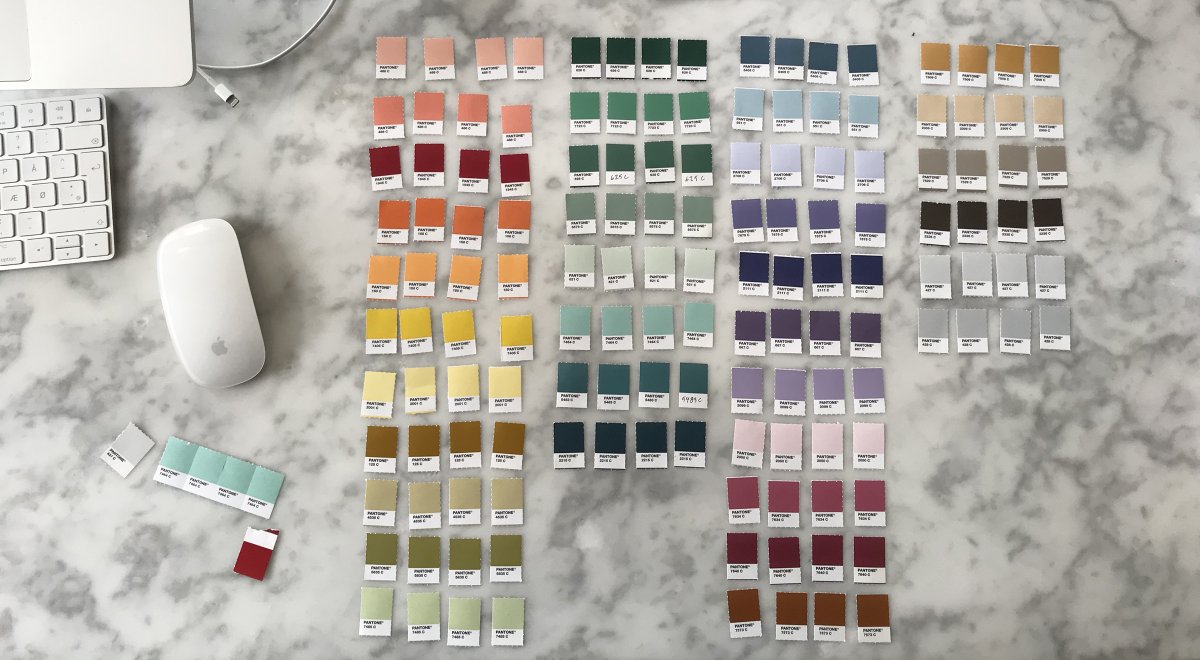
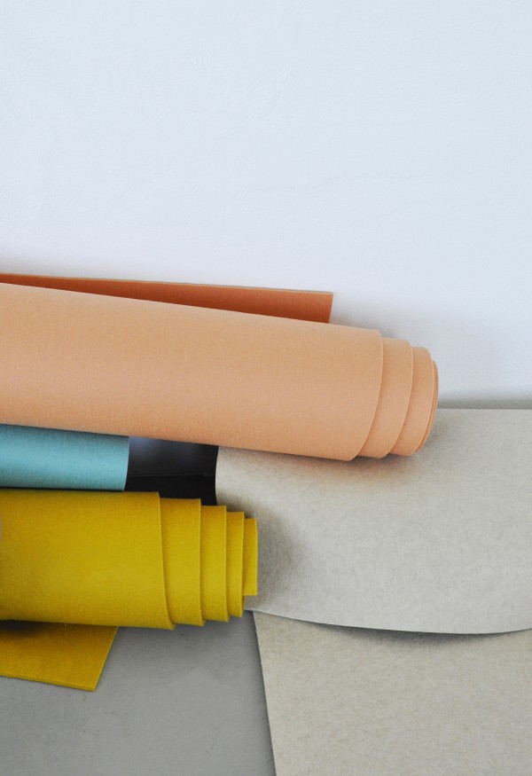
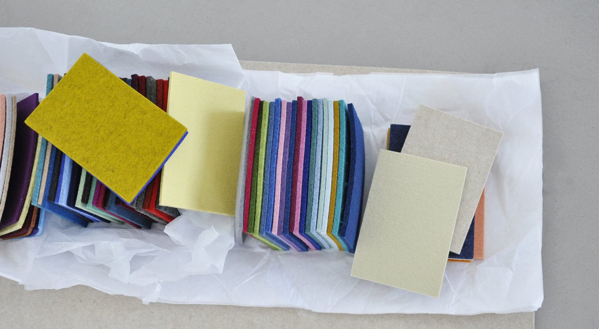
This past year, we partnered with Copenhagen-based designer and trend forecaster Nina Bruun to expand our current color line to ninety-five felt colors. Working from our existing color palette, Nina developed a color scheme that includes forty new colors, looking to hues found in nature and her surroundings in Copenhagen for inspiration.
We caught up with Nina to chat about the process of developing a cohesive color palette, her go-to sources for color inspiration, and what she envisions and hopes for designers as we launch the new color collection.
Where do you look for inspiration when starting a new project?
I look for inspiration in a variety of places. It could be in nature or when I’m just walking around in my daily life. Even the smallest detail can kick-start a bunch of ideas. I also make sure to stay updated on what’s going on in the world and the impacts on cultures, crafts, and materials globally. I always get inspired by learning something new.
Are there any artists, designers, art movements, etc., that have continually inspired you throughout your career, and have any of those influenced this work specifically?
My mom is one of my biggest inspirations. She is so gifted and talented when it comes to color, and it was always a part of my upbringing. It just came naturally to her—I don’t even think it was a conscious effort on her part to incorporate it as much as she did. I also have quite a few professional heroes who inspire me, but the most important thing is to keep my eyes wide open to constantly discover new artists, designers, and trends.
When working with colors, I often take a look at the fashion industry. They’re way ahead of design in general and interiors specifically, but it’s always certain that the interior design industry will later reflect these trends.
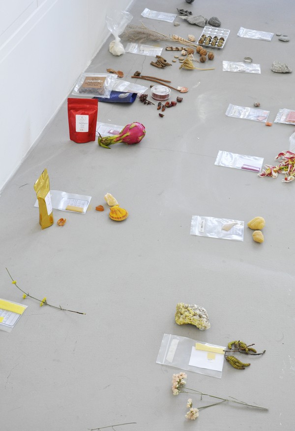
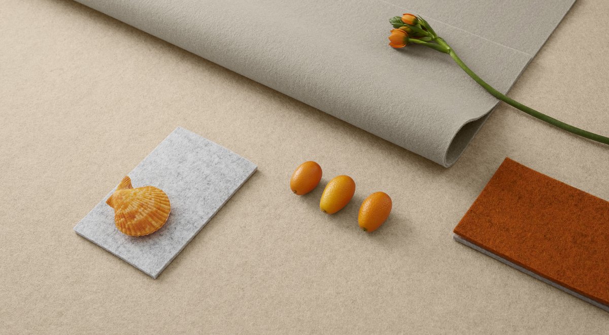
For this project specifically, the work of photographer Viviane Sassen has been a great source of inspiration. I love her approach to color and composition. One of the joys of working with felt is the material’s beautiful matteness—which allows you to look at so many other materials for inspiration. Ceramics and ceramic artists, for example, also played a role in my search for inspiration.
"I look for inspiration in a variety of places. It could be in nature or when I’m just walking around in my daily life. Even the smallest detail can kick-start a bunch of ideas."
When starting the process of developing the new color palette, where did you start?
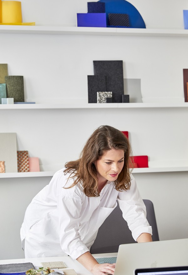
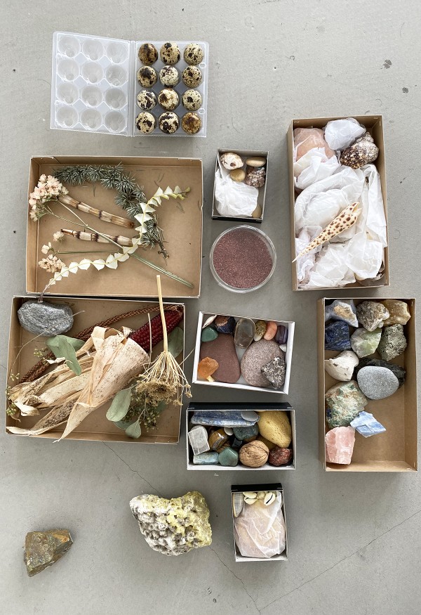
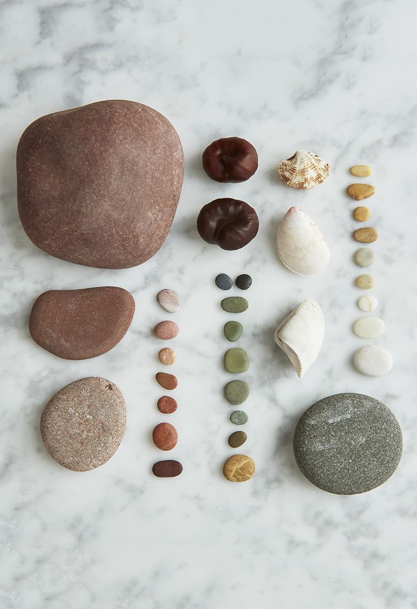
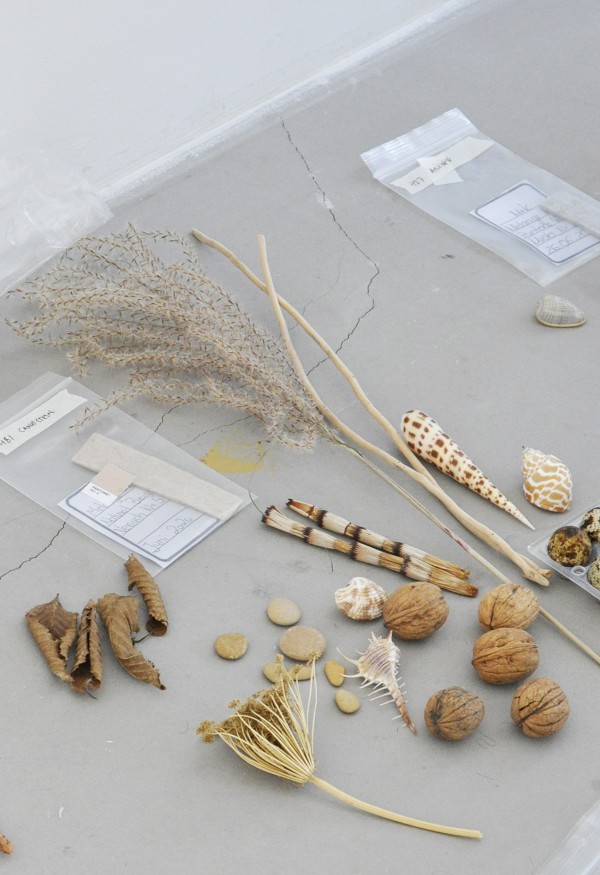
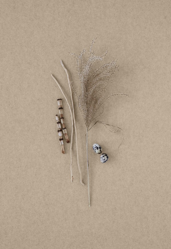
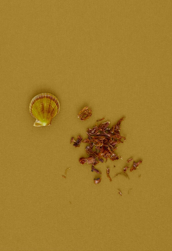
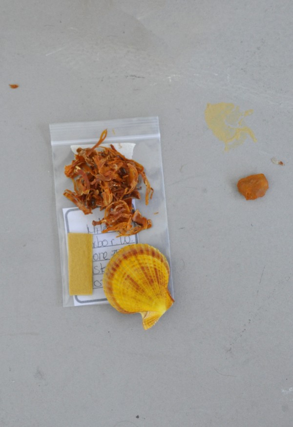
I started looking at “the holes” in the existing collection—what colors I felt were missing—as well as the initial feedback and wishes from the FilzFelt team. From there, I started organizing objects and color samples in a grid together with the FilzFelt color samples. Little by little, I would swap out and narrow down the colors to the intended amount. That part of the project took place during the first lockdown in Copenhagen. The project filled the entire space of my living room—it was a huge part of my decor for several weeks.
What influenced the overall direction of the color palette?
Since felt is a natural material, it was important to start with colors found in nature and colors that would suit the wool/material. But my main focus was to create a palette that was cohesive but not boring—I really wanted to create a collection where as many colors as possible could easily be paired and mixed and still look beautiful.
“It was important to start with colors found in nature and colors that would suit the wool/material. I really wanted to create a collection where as many colors as possible could easily be paired and mixed and still look beautiful.”
What feelings do you want these colors to illicit and bring to a space?
My hope for the color palette is to make it possible for other creatives and designers to create the exact atmosphere they need – and dream of. I’m hoping it will become a toolkit for those who need it.
Having worked with clients around the world, have you noticed a difference in how different cultures interact with color and incorporate colors in different ways into everyday living and larger architectural/industrial projects?
Absolutely. First of all, it’s amazing to see how we live and dress with colors depending on where and how you live – that is very beautiful and inspiring. Often you see the differences not so much in the overall palettes but more clearly in what colors sell the most in the different countries—that can show you some interesting tendencies.
How did the architectural application of this material inform the direction of the color palette?
It was absolutely on my mind in the process. It’s important to remember that the little sample that you’re looking at at the start of the process has to look good when it takes up the entire space of a wall in a lobby or an office. I love the fact that the collection holds both colors that are expressive and more dimmed colors that are close to colors you’ll find in classic building materials. There’s something for every project and every taste.
How does your relationship with and life in Copenhagen affect your approach to design and more specifically, to this particular project?
I use the Scandinavian/nordic light in everything that I do – it affects all colors and surfaces, which is such a joy while working with projects like these. I also think the Scandinavian traditions for colors and materials have influenced my work as a part of my heritage and DNA.
Having worked with a variety of materials, what was your approach to working with wool? Did working with this particular material change your point of view?
I have a lot of respect for the material – it’s a joy working with. Respecting the material you work with is the most important starting point. I try not to force anything that doesn’t suit the material. With wool felt, for example, it was important to take the deep matteness into consideration.
Have you noticed any particular trends with wool happening now?
Wool, due to its composition, is a timeless material. There’s, fortunately, an increased focus on quality sustainable and timeless materials. I’m amazed by felt for many reasons, and the fact that the use of felt is so broad is amazing. Right now, it’s a joy to see felt being used as an architectural element such as acoustic solutions and room dividers.
How do you balance designing timeless colors vs trend colors?
I believe that working with timeless colors will result in a timeless collection which I value both for my clients and the environment. As long as you have a versatile collection you can follow the fast trends by combining the colors and create so many different universes.
What new projects are on the horizon? What are you most excited about for the year ahead?
Right now, the entire world is still facing Covid-19 and the consequences thereof. Despite this, I’m trying to (also) find the positives in the situation, and in times of crisis, we often have to be creative and view things in a different way, which I’m hoping will be the case here as well.
Together with my team, I’m immersed in other exciting projects, working on some exhibition-based products based on sustainability and alternative materials. The project will launch during Salone del Mobile 2021, and I’m really excited about it.
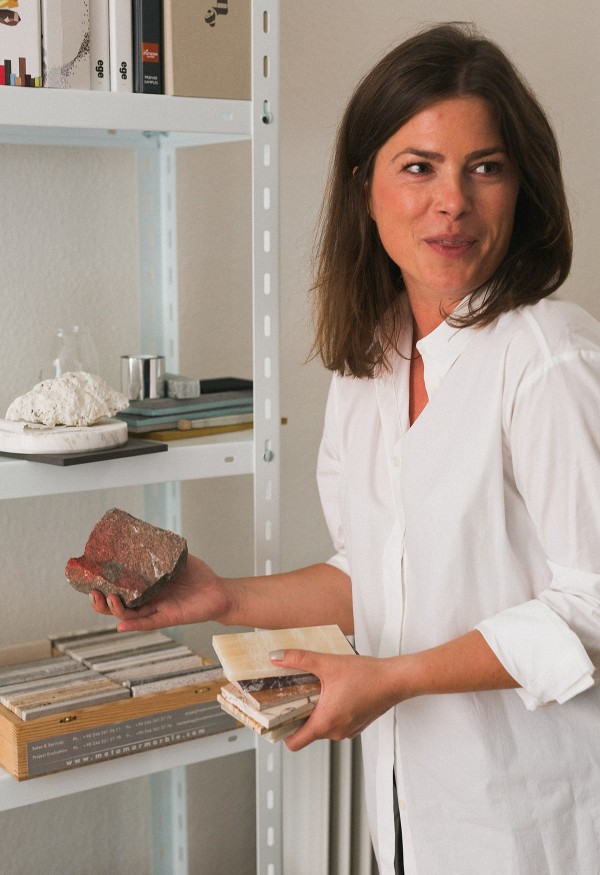
About Nina Bruun
Nina Bruun is an accomplished designer, trend spotter, and consultant based in Copenhagen, Denmark. In 2016, Nina started a multidisciplinary creative consultancy where she and her team create customized solutions in trends, colors, product design, and visual brand identity.